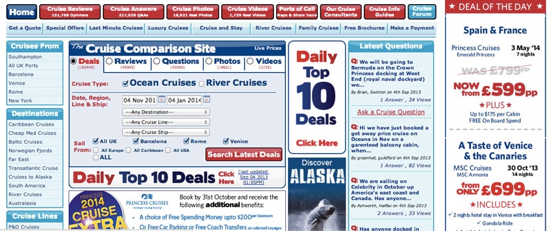
In order to build a list of the most common website mistakes, I looked at 50 small business websites and spent 5-10 minutes on each one.
Also, I see these same website mistakes all the time on my Website Consultations, which means that they are not isolated incidents, but rather a reoccurring problem with websites.
Today we’ll go over 5 common yet easily fixable mistakes, so come along now while we dive into each one:
1- The content is unclear, confusing and overly clever.
The problem with unclear or too clever texts on websites is that they are not able to get their message across. For example, when you visit a website and read the entire homepage without being able to understand what that company does, it can be frustrating. And when people visit a website and feel frustrated or confused, they just leave.
How to write clear content for your home page
The homepage of your website should be clear as to who you are, what you do, and why your visitors should care. It’s not enough that it is creative or clever if the writing isn’t readable; keep things simple but engaging by identifying these three key points so people can get to where they need quickly without wasting time figuring out what each section contains.
2- No credibility enhancers on the website
If you want to build trust quickly, credibility enhancers are a must on your website. Testimonials and logos of clients will help gain the visitor’s attention and it’ll be easier for them to believe what you say next! Listing any awards or certifications that demonstrate expertise in your field also helps prove how qualified you really are (and ensure visitors don’t go looking elsewhere).
How to build credibility through your website
- Include testimonials, logos of your clients including some well-known brands or media outlets that have featured you.
- Showcase awards and certifications
- Testimonials should be placed in context and not on a separate Testimonial page. You need to back up your claims every time you make one, so use testimonials when needed.
- Make sure your testimonials include a name (and if possible a photo) of the person.
3- Too many links in the navigation

The main navigation of a website is an important element, and the links it contains should be carefully selected. Having too many links in this section can cause visitors to leave: their attention span only allows for 5-7 seconds before they feel overwhelmed.
How to improve your navigation
- Don’t include more than seven items.The fewer the elements on your website’s menu bar, the higher is the probability that visitors will click on something.
- To make your navigation more concise, keep the labels as short and clear as possible. For example, instead of saying “Our Services” or “Contact us” say simply, ‘Services’ or ‘Contact’. This way your navigation becomes clearer without losing any information.
4- Visual Clutter

Seeing too much information on one page can be confusing and overwhelming. This increases cognitive load for your visitors, making them less likely to use the site or have an enjoyable experience while browsing.
How to avoid visual clutter on your website
- Keep your website design simple and clean
- Don’t use too many fonts or colors
- Make sure your font is easy to read
- Use white space to make your website look less cluttered
- Keep text short and concise
- Use bullet points or numbered lists for easier reading
- Avoid using too many images on one page
- Add links to other pages on your site so that the user can easily navigate through different sections of the website without getting lost
I’ve written a separate blog post that goes more in-depth on the topic of reducing visual clutter on your website – you can find it here.
5- Long paragraphs with no visuals
Long paragraphs that are not broken up with images or bullet points are difficult to read. This can be especially challenging on mobile devices, for which websites should be optimized.
How to make your website easier to read
- Break long paragraphs into shorter pieces
- Use bullet points and numbered lists so your website visitors can easily scan content
- If possible, include pictures on every page of the website so it’s easy on the eyes. If you have a lot of text, use an image here and there just to give people a break from all that reading.
Conclusion
The tips above should help you avoid the most common mistakes that can be found on websites. If you’ve been struggling with your website, it may be time to call in a professional who understands how human behaviour works. Feel free to contact me if you would like more information about what I have to offer, or if you want me to evaluate your website and make suggestions for improvement. Or if you want to take a look at my free resources, visit this link.


